Welcome
PRESENTYBOX is a website design studio serving clients worldwide.
Creating A Responsive Website With Wix Themes
May 8, 2023
Creating a responsive web with Wix themes is tricky; however, with the right tricks and techniques, a much more difficult task can seem easier.
Therefore, no need to worry since this article will enlighten you about all the tips and tricks to formulate a responsive website that is step up on one of the Wix themes.
Whenever selecting a forum for your business, you must keep in mind a lot of factors.
While considering creating a Wix Website, one must ask himself questions to evaluate his goals better. Questions such as;
How early do you want to hit the online forum? Who can and will handle your website?
How long can you wait until your efforts pay off?
Picking The Right Theme For Your Business
When starting a business like this, you must find the right template and theme to work on.
Wix has a variety of templates to match your taste. Some people pick out the blank templates and work their way out.

Wix Themes options.
Some popular Wix themes that are prevalently used among users are as follows:
● Personal Blog
In this theme, you can share your thoughts or your personal experience or journey about a particular spot.
● Business CV
Let your circle know about your business agenda.
● Creative CV
Through this creative CV, show your creativity by incorporating different skills and experiences.
● Travel Blog
Share your travel experiences with this blog and let the world around you know what it has to offer.
● Artist
Share your artistic talents in this theme of Wix and rise as a rising star.
● Graphics Designer
Another template of Wix to showcase your skills in graphic designing.
What Is A Responsive Design Wix?
A responsive web with Wix themes will be called a responsive web when it can adjust itself with the size of the device on which the site is viewed.
It will automatically respond to the default dimensions.

What Is Meant By Mobile-Friendly?
A website will be called mobile-friendly when it shrinks your site’s desktop version to a smaller screen. However, the desktop version will be a different experience than before.
This feature allows you to be user-friendly and does not impact your SEO.
Begin With a Clean Site
If you already have a responsive web with Wix themes all pumped up with your content, put off any extra padding and new boards.
This way, you can get focused on your responsive design Wix.
Utilize Questions from the Media Outlets
To use the media questions for your responsive Wix design format on your site, you can ensure a responsive design technique.
In this step, you will decide on different screen sizes and adjust the format accordingly.
Employ Adjustable Photos
One of many people needing help creating a Wix responsive design is dealing with images.
If your photos are adjustable, you may be able to revise them when your site is modified for different screen sizes.
To resolve this issue, you need to take help from image compression tools, for example, JPEG2000, to decrease the file length of your photos.
Utilize Flexbox
If you intend to employ an advanced form of responsive design Wix technique, you can take help from Flexbox.
This markup language enables you to adapt the format of your elements very easily.
Along With Media Questions, Use Conditional Loading
To create a Wix site, fully responsive, you will have to consider conditional loading.
This will enable you to load different elements based on the device’s size considering your site.
How Can Wix Sites Be Responsive?
Responsive web with Wix themes is popular among customers for providing the opportunity to create pretty websites regardless of using coding techniques.
Wix sites can be responsive like other websites to give users the best experience.
Undoubtedly, it is important to create a responsive design. These days, more people are using their mobile phones to visit their websites, and if your phone lacks this design to adjust smaller screens, you should try it out as soon as possible.
How Can Wix Be Made Friendly?
Wix is a website formulator enabling customers to formulate and design their websites.
One of the characteristic features Wix offers is the command to create a responsive website with the ability to adapt to any screen size.
This is an incredible attribute for those who want to ensure their website can be seen on any device, irrespective of the screen size.
How To Make Your Wix Responsive?
When we talk about website layout, we have to consider many other aspects of it.
One question that comes to many minds is whether Wix is responsive.
A responsive Wix website automatically adapts itself to the size of the device screen on which it is seen.
Making Your Website Fully Responsive With Wix
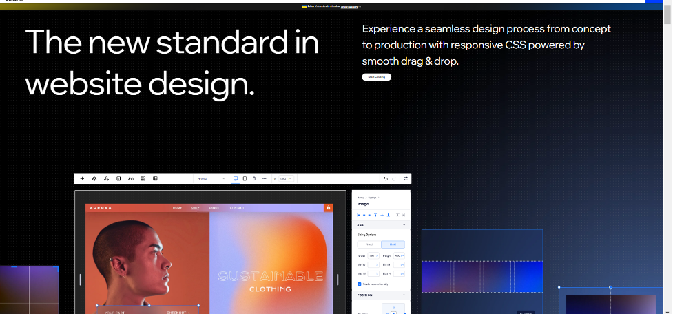
Via the Editor X forum, you can design a fully responsive site and make it as per your whims and wishes through CSS customizations and Flexbox technology.
In case you have already designed a site using the Wix Editor, you can formulate it and develop it as semi-responsive, or as we call it, mobile-friendly.
Relocating from Wix to Editor X (beta migration, a new update that became available on March 24, 2021) is another alternative.
Velo is yet another choice you can opt for. Velo is Wix’s web development forum for advanced functionalities—a developed tool for clients in case they need to organize databases and add custom code.
Most customers do not need such progressive functions and are all packed with the new standard features Wix Editor presents.
Wix Editor VS Editor X
As for beginners, Wix Editor is still the first choice and preferable for most businesses, especially those businesses with not-so-expert tech people.

Those who want to have a fully-responsive site and are at peace with the functionality of Editor X should go for it, but the Wix Editor is what most clients choose.
The reason it is convenient to most customers is that the editor is manageable for them to utilize once we provide the site to them (comparatively more effortless than the Editor X platform).
It’s the only efficient way to get them online quickly, so they can start earning through their website.
Components That Are Full-Width and Responsive In The Wix Editor
Strips and columns are used to construct sites for the customers so they can determine the size of each column and the content that needs to be organized.
Ensure that the elements have been connected to your strip, as it can be evident if you drive the strip and the component stays with the page rather than the strip.
● Full-Width Slideshows
These can be utilized for the main slider on your homepage, to promote a special slideshow you’re running, or showcasing a notification in the preheader of your navigation.
● Galleries
In case you see a stretch icon know that the gallery you have chosen is responsive and can be set to full width.
● Horizontal Menus and Lines
Horizontal menus and lines with the stretch icon assigned will automatically modify the width of your screen.
Also, horizontal menus and lines with the stretch icon selected will automatically adjust to the width of your screen.
● Google Maps and Other Wix Apps
Google Maps and other Wix-developed apps are also responsive. Just look for the stretch icon and bring in the full width.
Create A Responsive Mobile Version Of The Wix Website
Here we will discuss six tips to get started with a responsive mobile version of your Wix site.

Customize Your Mobile Site
For this one, you can be someone other than an expert in UI UX design.
The trick is manually reviewing each mobile page and recovering all the minor details that will unnerve potential reviews.
For instance, a cut-out logo on the edges or a paragraph’s expanded size will create a big difference and worsen the user experience.
Every time you get to the end of a page on the desktop, go to the mobile version. Usually all Wix themes have it in place.
Review the order of strips and ensure it gets along with your elements.
When it reaches the fonts, adjust their size.
Moreover, when it comes to photos, doubly review images that can be cropped on mobile automatically and revise them from your mobile or smartphone.
By using the INSPECT tool, one can operate to check the mobile version of the site. This tool indicates various screen and resolution sizes, enabling us to see which elements require modifications.
Conceal Unwanted Elements
This feature called “hide” is considered Wix’s smart function and allows you to deduct particular excessive elements from mobile without deleting them completely.
Many Wix users choose not to “hide” all the website’s features, worrying that a possible user might not be interested in their services.
Although it’s not a good idea, hiding some traits on mobile that are not frequently used is fine.
Key Takeaways
When starting a business like this, you must find the right template and theme to work on.
Wix has a variety of templates to match your taste. Some people pick out the blank templates and work their way out.
Wix themes such as Personal Blogs, where you can share stories from your personal life experiences; a Business and Creative CV to showcase your skills in your professional life, a travel blog to let the world know about your travel updates; and an artist template for your artistic talents.
A website will be called mobile-friendly when it shrinks your site’s desktop version to a smaller screen. If you already have a Wix site all pumped up with your content, put off any extra padding and new boards.
To use the media questions for your responsive Wix design format on your site, you can ensure a responsive design technique. If your photos are not adjustable, you may be unable to revise them when your site is modified for different screen sizes.
To resolve this issue, you need to take help from image compression tools, for example, JPEG2000, to decrease the file length of your photos. If you intend to employ an advanced form of responsive design Wix technique, you can take help from Flexbox.
To create a Wix site, fully responsive, you will have to consider conditional loading.
This will enable you to load different elements based on the device’s size considering your site.
Using Wix Editor X.
Via the Editor X forum, you can design a fully responsive site and make it as per your whims and wishes through CSS customizations and Flexbox technology.
Wix is a website formulator enabling customers to formulate and design their websites.
One of the characteristic features Wix offers is the command to create a responsive website with the ability to adapt to any screen size.
As for beginners, Wix Editor is still the first choice and preferable for most businesses, especially those businesses with not-so-expert tech people.
Those who want to have a fully-responsive site and are at peace with the functionality of Editor X should go for it, but the Wix Editor is what most clients choose.
To create a responsive mobile version of the Wix website, you need to customize your mobile version of the Wix site. For this one, you can be someone other than an expert in UI UX design.
The trick is manually reviewing each mobile page and recovering all the minor details that will unnerve potential reviews. Second, you need to conceal unwanted elements.
This feature called “hide” is considered Wix’s smart function and allows you to deduct particular excessive elements from mobile without deleting them completely.
Read the latest
CONTACTS
Finally, a website that moves as fast as you do — just one instant download and a matter of hours from going live
UNLOCK 10% OFF WIx, SHOWIT & SQUARESPACE templates
JOIN the LIST and NEVER miss a THING!
PRIVACY POLICY
© 2026 PRESENTYBOX | ALL RIGHTS RESERVED
Main
TEMPLATES
TO TOP
home
BLOG
CONTACTS
showit templates
wix templates
SQUARESPACE TEMPLATES
PRESENTYBOX is a website design studio serving clients worldwide. Specializing in Showit WIX & Squarespace website design for female entrepreneurs.