

Squarespace Before and After Image Slider
Guide to Setting Up a Squarespace Before and After Image Slider
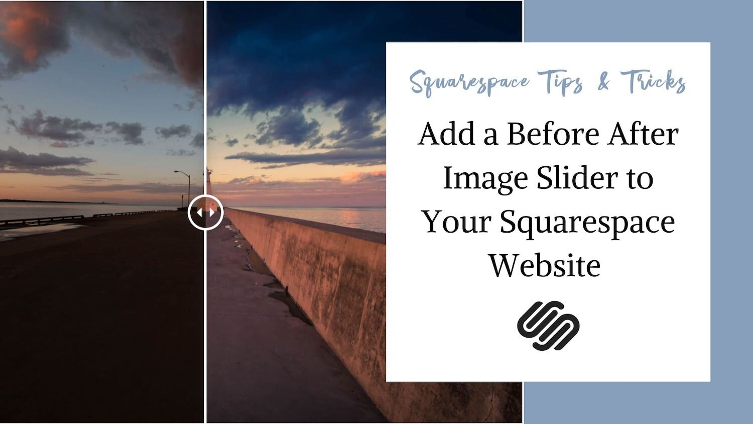
An image slider tool shows impressive results. The tool shows a direct image comparison through user interaction. Users can move the slider to watch how two pictures differ.
People will find this useful for several purposes. Examples include:
Highlighting Project Results
Let users see your work’s transformations in action. Apply this tool for home makeover displays, fitness updates and building renovations.
Comparing Product Versions
Squarespace Before and After Image Slider may Show people the latest product updates through this feature. Show your customers how something looks before you work on it and after you’re finished. The tool shows good results when you use it for product redesigns and upgrades.
Displaying Creative Edits
Squarespace Before and After Image Slider can Present your changes to photos and design graphics. Easily find when you’ve either lightened up an image or given it a whole new look.
Show Transformation through Storytelling
Use it to show change over time. Great tool for fitness coaches, nonprofits, and professional advisors.
Explaining Concepts
Add Squarespace Before and After Image Slider to tutorials or blogs. Look at images side by side so anyone can see visual contrasts, variations, or how things shift.
Why Use This Feature?
A slider boosts your website’s appeal. It makes your work more engaging. Visitors stay longer and explore more. Squarespace Before and After Image Slider may easily increase trust and boosts conversions.
In this guide, you’ll learn how to create the slider. Options include custom code, plugins, or Squarespace features.
How to Use the Guide
This guide helps you create an effective Squarespace before and after image slider. It covers selecting the right images, integrating the slider, and optimising your design. Whether you’re new to Squarespace or updating an existing site, these steps simplify the process.
Steps to Create Squarespace Before and After Image Slider
- Choose the Right Images
Choose and use photos that show obvious contrasts. Make sure the images are alike in size and fit like they belong together.
- Set Up the Slider
Install the slider directly via Squarespace features or add one from an outside source. Check that the slider works on your website.
- Integrate the Slider
Place it on the right page. Be sure to fit it properly into your page structure.
- Optimise the Design
Keep it simple. Use simple design elements with neat text and color choices. Let the images shine.
An image slider before and after shows several advantages in displaying transformations.
- Visual Storytelling
Speaking about change better than regular text. The images tell the story.
- Simplifies Complex Messages
Organizes hard to compare topics into clear visuals anyone can follow.
- Engagement
Increases time on your site. When readers browse into the site they get to interact with different content options.
- Professional Look
Enhances your site’s design. Squarespace Before and After Image Slider makes your content look better and more professional.
Adding a Squarespace Before and After Image Slider
A Squarespace website gains more visitor involvement through the use of before and after slide images. Your visitors can actively compare between pictures when they use this feature. Follow these easy steps to include this interactive slider on your Squarespace site.
Steps to Add Squarespace Before and After Image Slider
- Open Your Squarespace Access Page
To get started, enter your password for your Squarespace account. Visit the website you want to change.
- Navigate to the Desired Page
Choose the webpage that will show the slider. When starting a new page, go to Pages section, look for “Add Page” choice, and create the page.
- Add a New Section
Go to the page you wish to change, choose “Edit” to make your updates. Give a new spot on the page to put the slider. Pick the section type that matches your design.
- Insert a Block with Slider Support
From the new section click the plus sign to add a new block. Select the “Code” or “Embed” block which works with sliders. These blocks let you paste your own coding or add external generation tools to create sliders.
- Use a Third-Party Tool or Custom Code
Order your slider using Twenty-twenty’s tool. When you want total control, you can turn to your own unique JavaScript coding for the slider. Make sure the tool you pick works with Squarespace.
- Upload High-Quality Before and After Images
Choose the pair of images you want to show. Upload them to your Squarespace site. Make sure your images are high quality to keep pictures looking good.
Tips for Image Selection
- Keep your camera angles and size settings uniform throughout different pictures.
You will achieve the highest quality results when your two images come from the same viewpoint and have matching measurements. By keeping angles and dimensions the same this will create a better blend of pictures that appear professional.
- You should compress your images to improve website loading speed.
Website performance can get worse when you have large files for images. Shrink your photo files before putting them on Squarespace, so people see your site run smoothly when they visit it.
- Check how the Slider performs across all screen types
View how the slider works on different screen sizes – desktop, tablet, and phone – to make sure it loads and displays well everywhere. Look over the information and alter it for maximum responsiveness.
You can build an interesting slider for your Squarespace website when you apply these basic instructions.
Squarespace Before and After image Slider for Video
Using a video slider helps you display changes while they happen. Unlike the simple slide shows we are used to, video sliders mix moving pictures and transition effects that grab people’s attention more easily. Follow these steps to design and adapt your video slider for use on your Squarespace site.
Making a Video Slider, Step by Step
- Use Editing Software
Launch your projects with Premiere Pro or similar programs. Final Cut or DaVinci Resolve also work. These tools let you make exact changes and personalise your slider easily.
- Add a Movement Transition Between Sliding Clips
Join two video clips with a moving connection. You set up a view of what happens first and second. Make sure the changeover happens easily and attractive.
- Send the Video with Clear Detail
When you have finished your final edit save your video in high definition. Making sure your slider looks good everywhere helps you create a professional look on all devices.
- Upload the Video Using a Video Block
Start by making a new Squarespace section, then select a video block. Paste the video or place it on YouTube or Vimeo so viewers can watch the clip.
- Enable Responsiveness for Mobile Devices
Set video slider settings in a way that makes it work well on smartphones. Check your video across several display sizes to validate support on all devices.
Benefits of Video Sliders
Video sliders catch viewers’ attention through their moving visual elements.
- Video elements grab and hold viewer attention by nature. You can engage your audience better with a video slider setup that lets people see comparisons before and after.
- It works well for displaying both creative design work and video components with movement.
- Display what you achieved by showing off videos you made yourself – whether that’s animated drawings, filming your work steps, or editing products. Anybody who creates visual content, like designers, video editors, and marketing pros can use it right away.
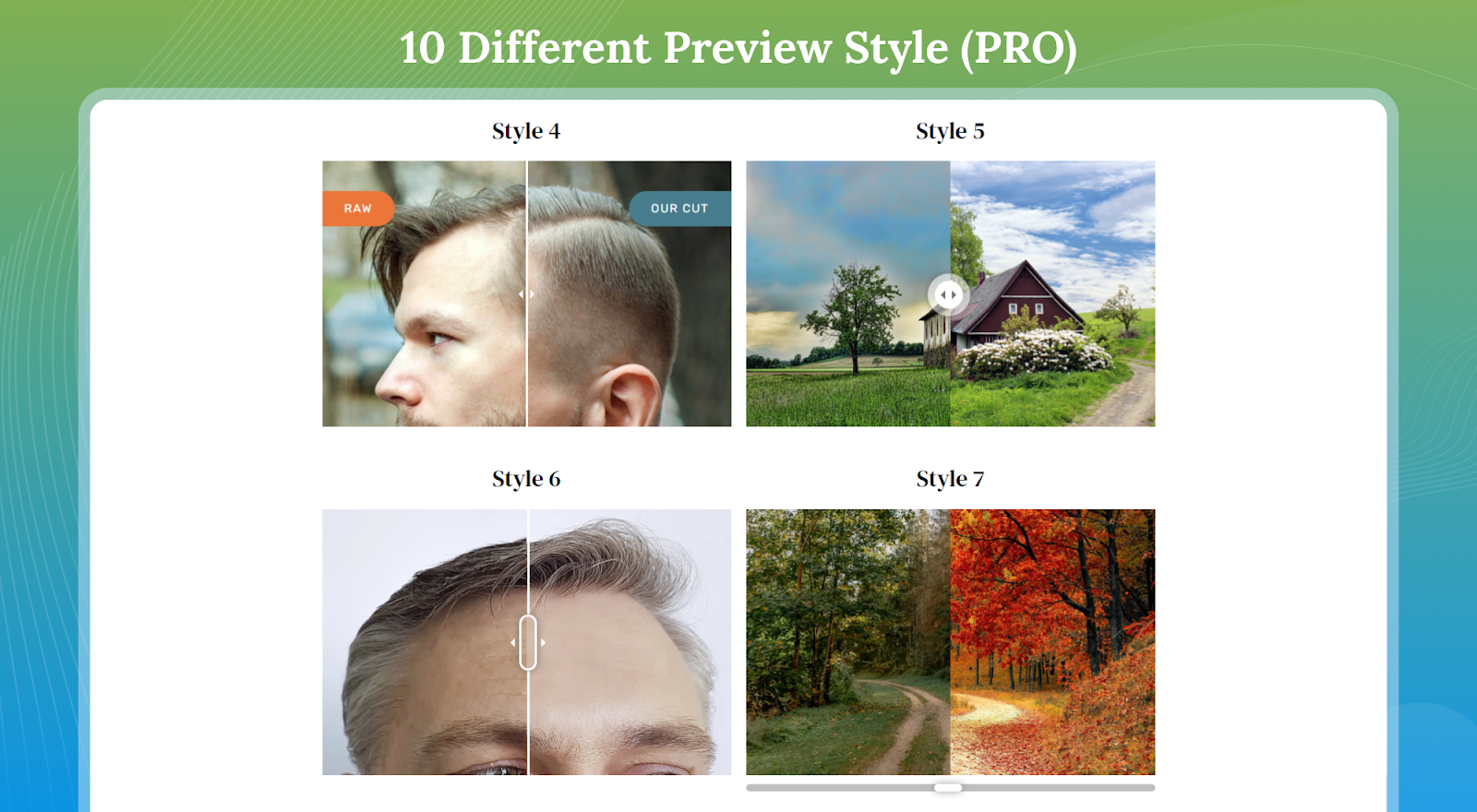
Personalize Your Image Slider Appearance
Basic Adjustments
- Position sliders to match the layout of your page design
Position the slider where it enhances the page design. Make it look right by matching your slider with the rest of your page layout.
- Alter the slider handle to match your desired color
Make the slider handle a different color to help visitors see and use the slider better. Select a different color that makes the interface easy for users to interact with.
Advanced Customisation with CSS
- Adjust Slider Line Thickness
You can customize slider line thickness through CSS style modifications. The thickness of your dividing line should match your design strategy. Choose a strong line when you need impact while sticking to minimal size for basic styling.
- Modify Animation Speeds
Change how your website moves things around to match the style of your site. Different transition speeds create either a polished upscale feel or a dynamic energetic presentation.
- Use Hover Effects as Unique Styling Elements
Give the slider more interactivity by making it change when visitors move their mouse over it. When users place their cursor above the handle the slider should light up to draw attention. Making this happen makes your website more engaging.
Video sliders freshen up and move your Squarespace pages. They’re great tools for showing off how you create or how one item transforms into another or compares well with others. Using these setup steps with customization tools helps you build a slider that keeps viewers interested and matches your brand design.
Popular Uses for Before and After Sliders
Using before and after sliders lets us communicate our messages better with visual data. Companies in many different industries use these slides regularly to show how things have changed or gotten better. These are the most well-loved forms of using before and after sliders:
Creative Portfolios
- Present your photo editing work by putting unedited and photos side by side.
- Display your graphic design changes through reworked logos, revamped brochure layouts, and full brand picture adjustments.
- Explain your work method, from making drawings to completing your digital drawing.
Home Improvement
- Show the value of upgrades through picture comparisons from when the space was raw to its newly transformed state.
- Showhow bare lawns have been turned into beautiful and well-designed garden spaces.
- Illustrate what happens inside homes when you add fresh paint, install new floors, or change your furniture in interior remodeling projects.
E-Commerce
- Display visual examples of changed product features that demonstrate present-day enhancements.
- Show customers the product benefits by showing how it changes their appearance or performance.
- Give customers an online tool to see how clothes or jewelry might look by using sliding scroll bars.
Additional Applications
Health and Wellness
- Show users their real-world wellness changes.
- Exhibit changes in your skin that happen when you use treatments or skincare products.
Construction and Architecture
- Use visual examples to show how your building work evolves beginning with the ground and ending at the final version.
- Make side-by-side comparisons betweenplans for buildings and their finished states.
Education and Training
- Display how students develop their artistic skills through pictures, drawings or coding activities.
- Demonstrate how specific teaching materials help students learn better.
Best and best-again sliders help people in all fields show their work’s value quickly and elegantly. By straightforwardly showing viewers how things change, they keep people watching. The before-and-after slider tool helps your content become more attractive and noticeable, whether you want to display personal or professional work.
Recommended Squarespace Templates for Sliders
Kristine Template
Artists and design professionals will find Kristine the perfect template to display their work or build their portfolio website. The template’s basic and current style enables developers of imagery such as photographers or graphic design specialists to display their high-quality content.
By relying on Squarespace’s Fluid Engine our team can customize grid layouts with extreme precision. With this tool you can move content around and design customizable spaces that make your work stand out. Kristine creates a clean visual space through her design choices to help you focus better on your work.
Through its landing page structure Kristine applies the simple design principle of minimalism. The template gives you powerful design tools to present excellent content visually without complex details. The template makes adding video content and image galleries easy while creating a professional design.
To present your creative work effectively Kristine builds websites that look outstanding and serve their purpose well.
Learn more about Kristine template and get started here.

Elisabeth Template
Those who want a professional website for work purposes will find Elisabeth template a perfect fit. Its grid format helps you present content in understandable and neat sections which makes this template suitable for digital displays of changes, business items, or written updates.
Through Squarespace’s Fluid Engine customization Elisabeth allows extensive control over the website design. You can adjust template portions to show products or services while also sharing articles in this setup. The template accommodates both visual and practical needs so you can keep your site attractive and work well together.
The design and writing systems in Elisabeth help bloggers set up content pages with images and text effectively. The template works well on every screen because its design responds automatically to different device sizes.
Elisabeth offers all the tools for creating websites that adapt perfectly to any screen size and situation. The template works well for any type of site whether it’s used to run a business, manage a blog, or show off your portfolio.
Learn more about Elisabeth template and get started here.
Tips for Choosing a Template
Focus on Content
Select a visual template that puts your images first. A quality template helps enhance your visual content and draws attention towards it first. Pick designs that use clear visuals so your work stands out on any display.
Ensure Mobile Compatibility
Templates should work properly on every internet device. When your slider performs well on computers but not on phones it can drive away many users. Verify mobile page display before using the template as purchased.
Experiment with Layouts
You shouldn’t stick with the first template you find. Test different design combinations including slider functions to find the best presentation for your content. Customize your Squarespace template choices through available modifications to reach your desired site layout.
Label Clearly
Place “Before” and “After” text labels on each slide to show users what your slider presents. Your audience will not encounter confusion thanks to this simple approach.
Maintain Consistency
Position your shots the same way and capture them in the same lighting condition. Yourslider takes on a professional look because all images blend together easily.
Test Interactivity
Test the slider on web browsers Chrome, Safari, and Firefox to check how it works. People must experience trouble-free use when interacting with the slider no matter what device they access your content.
Add Descriptions
Supply short descriptions about the sliders alongside them. Visual comparison becomes more meaningful through these brief descriptions which reveal the background of changes.
Common Mistakes to Avoid
Using Low-Quality Images
When you showcase low-quality images in sliders they decrease their effectiveness and damage your site’s professional look. You will improve your results when you work with sharp and optimized image files.
Overcomplicating the Design
When you make sliders too complex users get lost. Design your sliders so users can navigate them easily while seeing distinct slide labels. Making the design easy to use while holding visitor interest helps better serve your audience.
Ignoring Mobile Users
Not optimizes your website for mobile devices will cause serious problems. By trying your slider on different screen sizes you can confirm that it works perfectly everywhere.
By applying these suggestions you can develop a Squarespace website that displays stunning results on sliders.

FAQ
What benefits will I gain from using a Before and After Slider on my Squarespace website?
By adding a slider to your website you will attract more viewers while simplifying content and making your website look more professional. The tool helps visitors stay longer on your site and shows your work in a clear visual way.
How do I include a Before and After Slider into my Squarespace web design?
You can insert a slider into Squarespace by relying on their own tools or external resources and coding solutions. To create the slider you need to upload excellent images then input a block that supports sliders alongside mobile optimization.
Can I display videos side by side using the slider tool?
You can build Before and After Video Slides using both Premiere Pro and Final Cut Pro editing tools. Put the video into Squarespace’s video block then make it mobile-friendly.
Which types of projects work the best when using a Before and After Slider design?
The slider helps you show creative work and home projects as well as sell products for e-commerce and health platforms in addition to demonstrating educational content. It works well in any scenario whether you have individual or organizational requirements.
Conclusion
A Squarespace before and after slider delivers effective visual content. People respond better when you put your content and changes front and center to make your website more visually attractive.
You can establish professional aesthetics with templates such as Kristine and Elisabeth. The tool works naturally by letting you display your photographs clearly to your audience.
Aim to create user experiences through high-quality designs that respond instantly for better results. When you build your slider setup properly it will attract viewers to your website.

